

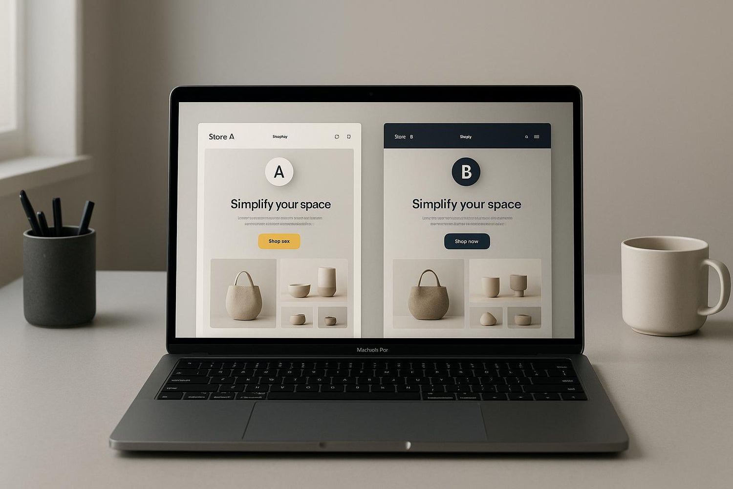
Testing your Shopify theme is just as important as testing your ads. Why? Your theme directly impacts conversions, revenue, and user experience. Here’s what you need to know:
- Themes affect conversions: A faster, better-designed theme can increase conversions by up to 200%.
- Small changes matter: Adjustments like repositioning trust badges or tweaking button colors can lead to measurable gains.
- Key areas to test: Focus on page speed, product layouts, checkout flows, and mobile responsiveness.
- Long-term benefits: Unlike ads, theme optimizations deliver ongoing results without additional spending.
How Themes Affect Conversion Rates and ROI
Your Shopify theme isn’t just about aesthetics - it’s a revenue driver. Unlike paid ads, an optimized theme delivers ongoing results, converting visitors into customers without additional spending.
Here’s the deal: a well-designed theme can boost conversions by up to 200% through quality design, and A/B testing can add another 49% on average. With most eCommerce stores converting only 2–3% of visitors, even small tweaks can lead to noticeable revenue growth.
What makes this even better? These improvements are long-lasting. Once you’ve streamlined your checkout process or fine-tuned your product pages, those changes work tirelessly to increase sales - no extra ad spend required. Let’s break down how specific theme elements impact conversions.
Page Speed and Performance
Speed isn’t just a convenience - it’s a game-changer. Websites that load in under two seconds see a 15% higher conversion rate. On the flip side, a one-second delay can slash conversions by 7%.
Mobile performance is even more critical, as over half of global web traffic now comes from mobile devices. A slow mobile site can lose 20% of conversions for every second of delay. And if a page takes more than three seconds to load, 53% of mobile users will abandon it altogether.
Big brands have proven the impact of speed. Walmart discovered that shaving just one second off load time increased conversions by 2%. Mozilla cut its page load time by 2.2 seconds, leading to a 15.4% jump in organic traffic. Pinterest reduced its perceived load time by 40%, which resulted in a 15% boost in SEO traffic and a 10% increase in ad revenue.
Faster load times also encourage visitors to stay longer. A one-second improvement can lead to 11% more page views. Sites that load within three seconds see visitors browsing 60% more pages, creating more chances for sales.
But speed isn’t the only factor - how your store looks plays a huge role in building trust.
Trust and Visual Appeal
First impressions matter, and for 95% of visitors, those impressions are based on visuals. In fact, 75% of a site’s credibility comes from its design. Your theme is essentially your online storefront, and its appearance can make or break a purchase decision.
Color is a surprisingly powerful tool. Around 85% of consumers say color influences their buying decisions, and using a consistent color scheme can boost brand recognition by 80%. When customers recognize and trust your brand, they’re more likely to hit “Buy.”
Visuals also drive engagement. A whopping 93% of buyers consider visual appearance when shopping online, and 67% say high-quality images are a deciding factor. Larger visuals can increase engagement by up to 94%. Plus, online reviews - trusted by 79% of shoppers as much as personal recommendations - add another layer of credibility.
Once trust is established, guiding customers through a smooth shopping experience becomes critical.
Product Flow and Customer Journey
How easy is it to navigate your store? Seventy-six percent of shoppers say ease of use is the most important part of their online shopping experience. In fact, 86% of visitors prioritize simple navigation when browsing.
Clear menus and well-organized categories make a big difference. About 73% of consumers prefer websites with straightforward navigation, and using breadcrumb trails can reduce bounce rates by 38%. These small details help customers find what they’re looking for quickly, keeping them on the path to purchase.
The checkout process is another make-or-break moment. With nearly 70% of shopping carts abandoned, a complicated checkout can be a major barrier. For example, Gymshark simplified its multi-page checkout into a one-click guest option, cutting cart abandonment by 33%.
Strategically placed calls-to-action (CTAs) also play a significant role. When optimized for color, placement, and wording, CTAs can boost engagement by 371%.
Don’t overlook mobile users. Over half of customers say a poor mobile experience affects their willingness to buy. A mobile-friendly design can increase conversion rates by 50%. GreenPal redesigned its site with a mobile-first approach, skyrocketing mobile browser conversions from under 4% to 82%.
Product pages are another area ripe for optimization. Take Glossier, for example. By adding user photos, how-to videos, and a tabbed layout to its product pages, the brand achieved a 38% increase in mobile conversions. Thoughtful design keeps shoppers engaged and drives more sales.
How to Set Up Theme A/B Tests
Running theme A/B tests on your Shopify store requires a clear and structured approach to ensure you gather reliable and actionable data. Here's how to effectively test your theme elements.
Define Clear Goals
Before making any changes, set specific goals to avoid vague or inconclusive results.
Start by pinpointing measurable objectives. Instead of aiming for something general like "improving the website", focus on tangible metrics, such as increasing conversion rates by 15%, raising the average order value by $25, or reducing bounce rates by 10%. These concrete targets make it easier to evaluate whether your test was successful.
A great way to frame your goals is by using a SMART hypothesis - one that's Specific, Measurable, Achievable, Relevant, and Time-bound. For example, instead of testing a broad idea like "better product images", try something like this:
"By replacing current product images with lifestyle images, we expect a 10% increase in add-to-cart conversions within two weeks because lifestyle images better showcase the product's functionality and help customers imagine using it".
Having clear, focused goals not only improves your A/B testing process but also directly impacts your store's conversion rates and return on investment.
"The most common issue brands run into while running an A/B test for your Shopify pages is getting ambiguous or non-meaningful results due to an ill-defined hypothesis."
– Josephine Cheng, Author at Replo
This level of precision helps you understand not just if something worked, but why - insights that are invaluable for future experiments.
Select Which Elements to Test
Not all theme elements are worth testing. Concentrate on areas that have the most influence on customer behavior and purchasing decisions.
Some high-impact elements to consider include:
- Headlines and product descriptions: Test different messaging styles - one might focus on features, while another highlights benefits.
- Call-to-action (CTA) buttons: Experiment with variations in color, text (e.g., "Buy Now" vs. "Add to Cart"), size, or placement.
- Product images and layouts: Try different hero images, gallery arrangements, or the number of images displayed.
- Social proof elements: Test reviews, testimonials, and trust badges to see how they affect credibility.
When running your tests, it’s crucial to change only one variable at a time. Testing multiple elements simultaneously makes it nearly impossible to identify which change drove the results.
By zeroing in on specific elements, you can run more precise tests and gather meaningful data.
Run Tests and Collect Data
To ensure your results are statistically reliable, run your tests for at least two full business cycles - typically two to four weeks. This allows you to account for weekly shopping trends and collect enough data for accurate analysis.
Sample size is another critical factor. Use a sample size calculator to determine how many visitors you’ll need for valid results. A general guideline is to aim for at least 100 conversions per variation. If your store has lower traffic, focus on testing high-impact elements that can provide insights even with smaller sample sizes.
While monitoring your tests, resist the urge to end them early, even if initial results look promising. Achieving statistical significance requires both enough time and sufficient data. To ensure your testing setup is reliable, consider running A/A tests periodically to confirm it’s not skewing results or affecting site performance.
Finally, document everything - your hypothesis, test variations, duration, and outcomes. This record will help you avoid repeating mistakes and build a foundation for smarter future testing.
High-Impact Theme Elements to Test
When testing your Shopify theme, it’s smart to focus on the areas that directly affect your sales. Not every tweak will make a difference - some changes can drive conversions, while others might barely register. Concentrate on the elements that truly matter.
Product Page Optimization
Product pages are the heart of your store. This is where customers decide whether to buy, so even small adjustments here can lead to noticeable improvements in conversion rates.
Image placement and quality are a top priority. High-resolution, zoomable images can boost conversions by up to 40%. Test different layouts, like a large hero image paired with thumbnails or a gallery-style setup that shows multiple angles at once.
Product descriptions and key details are another area to experiment with. Some shoppers prefer bullet points that highlight features like dimensions, materials, or care instructions, while others connect more with narrative descriptions that explain how the product fits into their lives.
Social proof placement can also have a big impact. For example, an online clothing retailer increased add-to-cart clicks by 10% simply by placing customer reviews beneath product descriptions. Experiment with different locations for reviews - right after the product title, near the price, or next to the add-to-cart button.
The number of reviews matters too. Products with over 50 reviews see conversion rates 4.6 times higher than those with fewer reviews. If you’re working with a limited number of reviews, highlight the ones you have by featuring star ratings prominently or showcasing standout quotes from customers.
Once your product pages are polished, focus on refining your calls to action (CTAs) to ensure a smooth path to purchase.
Call-to-Action Buttons
After optimizing your product pages, it’s time to zero in on your CTA buttons. These buttons are the bridge between browsing and buying, so they deserve careful attention.
Button color and contrast can make a surprising difference. A simple color change can increase conversions by 21%. Test bold, attention-grabbing colors that stand out from your site’s design. For example, if your site has a blue theme, try orange or red buttons to create contrast.
Button text and messaging can also drive results. Clear and specific CTAs - like “Add to Cart” or “Get Yours Today” - can boost conversion rates by 161%. Adding urgency works even better; phrases like “Limited Stock - Order Now” or “Sale Ends Soon” have been shown to increase conversions by 332%.
Size and placement are just as important. Larger buttons often perform better, with click-through rates increasing by 90%. However, size alone isn’t everything - test different dimensions to find the right balance between visibility and aesthetics. Placement is critical too. CTAs above the fold outperform those below by 304%, and centered buttons get 682% more clicks than left-aligned ones. Try positioning your CTA immediately after the product price or at the end of the description to see what works best for your audience.
Homepage and Cart Experience
Once you’ve fine-tuned your product pages and CTAs, shift your focus to the homepage and cart. These areas complete the customer journey and play a key role in turning visitors into buyers.
Hero images and headlines on your homepage are often the first thing visitors notice. Experiment with different types of imagery - lifestyle shots versus product-focused photos - and test headlines that highlight benefits instead of just features.
Reducing cart abandonment is crucial since the average abandonment rate across industries is a staggering 70.19% in 2025. Streamlining the checkout process can make a big difference. For instance, one Shopify store cut cart abandonment by 7% just by simplifying their checkout form.
Testing express checkout options and guest checkout features can also help. A significant 35% of online transactions are abandoned because customers are required to create an account. Offering a guest checkout option can eliminate this barrier.
Urgency and scarcity indicators in the cart can encourage quicker decisions. Real-time stock updates like “Only 3 left in stock” or “12 people have this in their cart” can increase purchases by 59%.
Finally, payment options and trust signals can reassure hesitant buyers. Display security badges, accepted payment methods, and clear return policies prominently during checkout. These small touches can make a big difference in completing the sale.
Why Shrine Themes Work Well for A/B Testing
Now that you know what elements to test, the next step is choosing a theme designed for straightforward and impactful experimentation. Shrine and Shrine Pro themes are built specifically with A/B testing in mind, giving you the flexibility and performance needed to run meaningful experiments - all without requiring extra development work.
Unlike many Shopify themes that make you choose between customization and performance, Shrine themes deliver both. This balance makes them an excellent choice for anyone serious about testing while keeping their customers engaged. Let’s break down why these themes are so effective for A/B testing.
Lightweight and Fast-Loading Design
When it comes to A/B testing, speed is everything. A bloated theme filled with unnecessary features and animations can make it hard to identify what’s actually driving your results. Shrine themes load 35–45% faster than average Shopify themes, while Shrine Pro offers an additional 15–35% speed boost. This kind of performance creates a clean, reliable foundation for your experiments.
A lightweight design removes variables that could interfere with your test results. For example, if you’re testing a new product page layout or tweaking a call-to-action (CTA) button, you need to be confident that any changes in conversions are due to your experiment - not because your site suddenly slowed down.
This speed advantage becomes even more important when you’re running several tests at once. Each new element - like a redesigned checkout flow or an updated image gallery - can add load time. Starting with an optimized theme ensures you can experiment freely without worrying about performance dips.
Faster load times also mean a better experience for your users across all test variations. That way, your results reflect genuine user preferences rather than frustration caused by technical hiccups.
Customizable Without Coding
One of the biggest barriers to testing is technical complexity. That’s where Shrine themes shine, offering extensive customization options without requiring any coding. This allows you to set up and adjust tests quickly, without waiting on a developer.
Both Shrine and Shrine Pro come with a variety of sections and blocks that you can easily rearrange to test different layouts, headlines, or homepage designs. For instance, if you want to see whether customer reviews perform better above or below the product description, you can simply drag and drop the review block into different positions. It takes minutes, not hours.
The customization options cover all the high-impact areas we discussed earlier. You can test various CTA button styles, tweak product image layouts, adjust homepage hero sections, and even experiment with cart features - right from the theme’s interface. No coding required.
This ease of use saves you a ton of time. Instead of spending days implementing a single test variation, you can create multiple versions in just one afternoon. The faster you can test and iterate, the quicker you’ll see meaningful optimization results.
Built-In Features for Advanced Testing
Shrine Pro takes testing to the next level by including advanced features that typically require multiple paid apps. From flexible layouts to upsell tools and dynamic product information blocks, this theme is packed with tools designed for split-testing.
The advanced cart features in Shrine Pro are especially useful. Built-in upsells, quantity pickers, and customization options can help boost your store’s average order value. And because these features are integrated into the theme, you don’t have to rely on extra apps that could slow down your site or cause compatibility issues.
“Shrine Pro Theme is hands down a must-have for any serious e-commerce store... Eliminates the need for many paid apps - I’ve easily saved over $1,000/year on subscriptions.” – badr-eddine Ouchhida
On top of that, Shrine Pro can save you over $150 per month on recurring app costs by replacing functionality you’d otherwise need to pay for. This is a big deal, especially when testing often requires multiple apps working together - each adding its own performance overhead.
The theme also includes 34 dynamic product information blocks compared to Shrine’s 22, giving you more elements to experiment with. Whether you’re testing urgency indicators, social proof placement, or product bundle layouts, the tools are already built in and ready to go.
With its combination of speed, customization, and advanced features, Shrine Pro makes it easy to run seamless and effective tests across your store.
How to Analyze Results and Make Changes
Now that we’ve covered how to set up tests, let’s dive into analyzing results and applying changes effectively. Testing only becomes valuable when you interpret the data and use it to drive improvements - all without disrupting the user experience.
The trick is to approach this process with a balance of statistical precision and practical business insights. You need to trust your results while ensuring any changes are implemented smoothly.
Review Metrics and Statistical Significance
Before making changes, confirm your test results are meaningful. Statistical significance helps you determine whether your findings are due to chance or represent a real difference. A p-value below 0.05 indicates statistical significance, meaning there’s less than a 5% chance the results occurred randomly. However, achieving statistical significance isn’t always easy - research shows that only 20% of experiments reach the 95% significance threshold.
"When we do hypothesis testing, we're always asking, does the evidence we collected make our null hypothesis look ridiculous? Yes or no? What the p-value does is provide an answer to that question. It tells you whether the evidence collected makes your null hypothesis look ridiculous. That's what it does, that's not what it is." - Cassie Kozyrkov, Chief Decision Scientist, Google
While a low p-value is a good starting point, also consider the effect size and confidence intervals to evaluate the practical impact of your results. For instance, if a new product page layout boosts conversions by 0.1% with perfect statistical significance but only adds $10 to your monthly revenue, the change might not justify the effort.
Confidence intervals are equally important. They provide a range of values where the true difference between your test variations likely falls. For example, if a new checkout button increases conversions by 3.2% with a confidence interval of 1.8% to 4.6%, you can be fairly confident the actual improvement is somewhere in that range.
Stay focused on the metrics that align with your original test goals. If your goal was to increase average order value, don’t get sidetracked by minor changes in bounce rate unless they’re unexpectedly negative. Define your objectives clearly and stick to relevant metrics to avoid being overwhelmed by irrelevant data.
Once you’ve verified your results, you’re ready to implement changes - but proceed carefully.
Roll Out Winning Changes Gradually
When you’ve identified a winning variation, roll it out incrementally to minimize risks and ensure a smooth transition for users.
Start by introducing the changes to a small portion of your audience - around 10% to 20% of your traffic - and monitor the results over a few days. Testing changes on a limited scale before a full rollout helps you catch potential issues that might not have surfaced during the initial A/B test. Sometimes, variations behave differently across devices, browsers, or user segments.
During this phase, closely monitor analytics. Keep an eye on metrics like page load times, mobile performance, and user behavior patterns. If any red flags appear, you can quickly revert to the original setup before affecting your entire audience.
Having a rollback plan in place is essential. Know exactly how to restore your previous setup if something goes wrong. For example, with Shrine themes, you can easily switch between different configurations without losing customizations.
Consistency is key during the transition. Maintain uniformity in critical areas like navigation, checkout processes, and customer service features. Even with improvements, customers should feel like they’re shopping at the same store.
After rolling out changes, document everything to guide future tests.
Document Tests for Future Reference
Keeping a detailed record of your A/B tests is invaluable for ongoing optimization.
For each test, document:
- The hypothesis you were testing
- The specific elements you changed
- The test duration
- The results and any insights gained
Include the reasoning behind each decision when implementing changes. Months later, you’ll want to remember why you chose one button design over another or what prompted you to test a particular layout.
Add screenshots of both variations to your records. Visual references make it easier to spot trends across multiple tests and avoid retesting the same elements. Note any external factors that could have influenced results, such as seasonal shopping trends, marketing campaigns, or promotions running during the test period.
Also, track how different customer segments responded to your variations. For example, if mobile users favored one layout while desktop users preferred another, that insight could shape future tests. These records help you understand user preferences and refine your strategies.
Regularly review your testing documentation to adjust your approach based on past results and evolving business goals. Over time, you’ll identify patterns - like specific types of changes that consistently resonate with your audience - allowing you to prioritize similar tests moving forward.
Conclusion: Themes as a Growth Tool
Your Shopify theme isn't just about aesthetics - it's a key driver of growth that deserves as much attention as your ad campaigns. Just like you wouldn't let an ad run for months without testing variations, your theme should be regularly optimized to boost conversions and revenue.
A/B testing your theme can lead to noticeable improvements in conversion rates. Some tests reveal surprising insights into customer behavior, helping you make data-driven decisions.
Think of it this way: your ads bring visitors to your store, but your theme turns those visitors into buyers. If you focus only on driving traffic but ignore the on-site experience, you're leaving money on the table. Every dollar and hour spent attracting visitors should be matched by efforts to create a seamless and persuasive shopping experience. This is where theme testing becomes a game-changer.
The best part? Theme improvements have a compounding effect. Unlike ads, which need constant spending, a well-optimized theme delivers ongoing value. For instance, simplifying your checkout process could lead to a 12% boost in conversions - a change that continues to pay off over time. These incremental gains stack up, significantly impacting your bottom line.
Regular theme testing also provides a window into your customers' preferences. Do they engage more with video content or static images? Does urgency messaging drive action? Would they rather navigate a simple menu or explore a more detailed one? Each test uncovers insights that guide smarter optimizations.
And here's the good news: theme testing doesn't have to be expensive or complicated. Modern A/B testing tools are user-friendly and often come with free trials, making it easier than ever for non-technical users to experiment without risk.
Shrine themes, for example, are an ideal starting point for testing. Their lightweight, fast-loading design ensures performance issues won't skew your results, and their extensive customization options let you tweak everything from product pages to checkout flows - no coding required.
The mantra "always be testing" is crucial for sustained growth. Once you implement a winning change, it's time to plan your next experiment. Prioritize high-impact areas like your homepage, product pages, and checkout process. Even small tweaks in these areas can lead to big gains.
Your theme works around the clock, either helping or holding back your growth. By treating it as a critical business asset and testing it with the same diligence you apply to your marketing, you create a reliable path to better conversions, higher revenue, and a competitive edge in the long run.
FAQs
What parts of my Shopify theme should I A/B test to improve conversions?
To boost conversions effectively, prioritize testing key elements of your Shopify theme that shape user experience and build trust. Focus on areas like hero images, call-to-action (CTA) buttons, headlines, product photos, and sections featuring social proof - such as reviews or testimonials. These components are essential for capturing attention and influencing buying decisions.
You might also try tweaking layouts, rearranging your homepage, or adjusting the placement of pricing and promotional offers. Even minor changes in these areas can uncover what clicks with your audience, helping you drive more sales and improve your return on investment (ROI).
What challenges should I watch out for when A/B testing my Shopify theme, and how can I avoid them?
Challenges of A/B Testing Your Shopify Theme
Running A/B tests on your Shopify theme can provide valuable insights, but there are a few common hurdles you should be aware of. For starters, testing with insufficient traffic or conversions can produce unreliable results. If you tweak too many elements simultaneously, it becomes nearly impossible to determine which change made a difference. Another frequent mistake is ending tests prematurely, before reaching statistical significance, which can lead to misleading conclusions.
To steer clear of these issues, ensure your store gets enough traffic to gather meaningful data. Focus on testing one variable at a time - like adjusting the page layout or tweaking headlines. Let your tests run long enough to capture reliable results. Finally, dive deep into your data and always compare it to your control group so you can make well-informed, data-backed decisions.
Can optimizing your Shopify theme reduce ad spending and drive sustainable revenue growth?
Optimizing your Shopify theme can be a game-changer for your store, helping you cut back on constant ad spending while driving steady revenue growth. A thoughtfully designed and fine-tuned theme enhances page speed, builds customer trust, and ensures a smooth product browsing experience - all of which directly impact conversion rates. The result? A more enjoyable shopping experience that keeps customers coming back, without relying heavily on ads.
By prioritizing your theme's performance and design, you can strengthen customer loyalty and get more out of every dollar you invest. This strategy not only makes your store run more efficiently but also sets the stage for long-term growth while minimizing dependence on advertising.